time
Location
Share Project
Industry
Consumer App
Time-Frame
16 Weeks
Tools Used
Framer
Year
2026
The Problem
Sable was entering a category with a trust problem. Personal finance apps had a long history of promising simplicity and delivering anxiety, and a significant portion of Sable's target audience had tried one or more competitors and stopped. The product itself was meaningfully different: less prescriptive, more observational, built around awareness rather than goal-setting. Communicating that difference to people who had already decided they did not want another budgeting app was the core challenge.
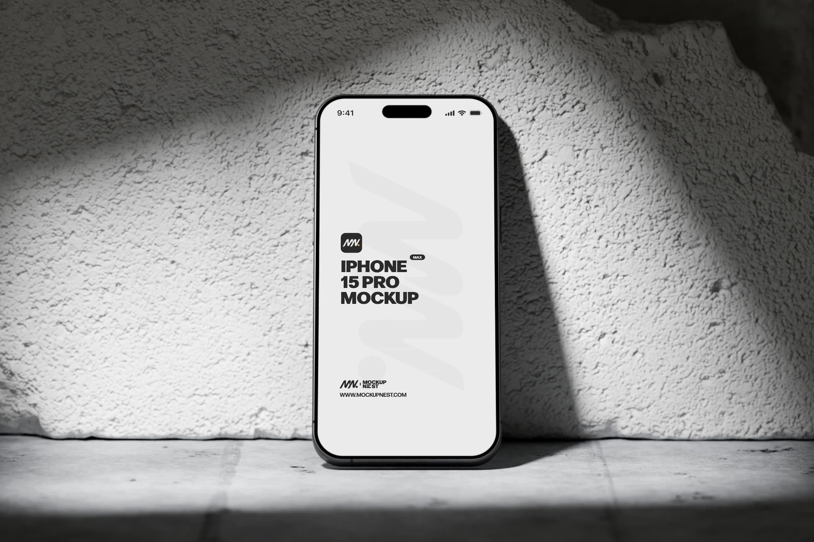
The visual language of the existing prototype read like every other app in the category. Bright greens for money, red for overspending, progress bars toward arbitrary targets. The design was signaling exactly the kind of experience users were trying to avoid, which meant Sable was losing people at first impression before they had experienced anything that made the product distinct.
"People would see the screenshots and say they had already tried that. They hadn't. But we looked like they had."
Founder, Sable
There was a secondary problem in the core interaction model. The way spending categories were assigned required manual input that users found tedious, and the default categorization was wrong often enough to undermine trust in the data. Users who saw incorrect categorizations early stopped trusting the numbers and stopped using the app.

The Solution
The design direction started with a deliberate departure from financial app conventions. Rather than the bright, urgent palette that dominated the category, Sable moved to something quieter: neutral backgrounds, soft typographic hierarchy, no red/green color coding for transactions. The visual language was closer to a reading app than a dashboard, which aligned with the product's actual intent: to surface patterns without judgment.
The onboarding flow was rebuilt around a lower-commitment initial experience. Instead of asking users to connect all their accounts and set up a full budget before they had seen any value, the new flow showed Sable's insight model working on a small sample of transactions first, giving users a concrete preview of what the product actually did before asking them to commit their financial data.
"We stopped looking like the problem and started looking like the alternative. That changed every conversation we were having."
Head of Growth, Sable
The categorization problem was addressed through a combination of improved default rules and a lighter-touch correction UI that made it fast to fix errors without breaking the ambient, low-friction experience the product was aiming for.

The Result
App store conversion from page views to downloads increased following the visual redesign, with the team attributing the improvement primarily to the screenshots better reflecting the actual product experience. Seven-day retention improved from 31% to 54% after the onboarding rebuild, driven largely by users reaching the first meaningful insight moment before the end of their first session.
The categorization improvements reduced correction actions per user by over half, which the team measured as a proxy for trust in the data. Users who trust the data check the app more frequently, and frequency of use is the strongest predictor of subscription conversion in the category.